NOVA Logo
As a distinctive visual identity, the NOVA logo is the most immediate representation of our institution and our people. It is a brand — stamp of quality — that unites us, from the courses we teach to the exceptional student experience we provide, both on and off campus. Therefore, the logo should be used in all situations that call for the official mark of the College.
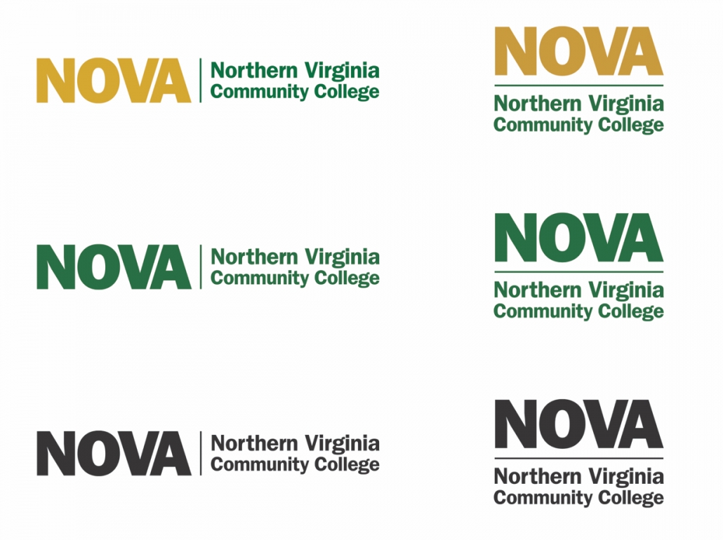
The two-color treatment NOVA logo is a key branding element. Whenever possible, the two-color treatment logo should appear prominently in all communications created by the College. It can also appear as a one-color treatment in NOVA green or black when color is not available.
Download Logos here.
Placement and Sizing
There must be sufficient space around the logo to make it stand apart from other visual elements. Text, headlines, photographs or illustrations should never be closer to the logo than half the width of the letter “N” in “NOVA.”
In all applications, the logo should be reproduced at a size that maintains the integrity of the mark and yields clean, legible lettering. There is no maximum size limit, but use discretion when sizing the logo. In most cases, the minimum size for the horizontal NOVA logo should be no less than 1 1/2 inches wide and the vertical NOVA logo should be no less than 1 inch wide for print. For use on the web, the logo must be clear and all words in the logo must be legible.
![]()