Typography
The NOVA typography system is an important element of our voice. It consists of two typefaces: Minion Pro and ITC Franklin Gothic. Both typefaces come in a variety of weights and styles that are used throughout the brand, allowing versatility and flexibility. These fonts can be bold and strong, but can also be quieter, more restrained and classical. Use a weight that best suits the message.
The consistent use of these typefaces on print, digital and other applications will make for a recognizable and consistent identity.
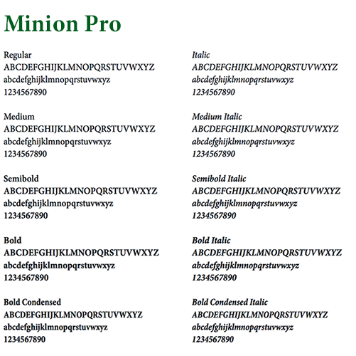
Serif Typeface
Serif typefaces provide a classic appearance and high legibility. Minion Pro’s forms are an amalgamation of modern, machine-like shapes and hand penmanship.
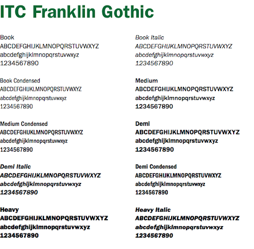
Sans Serif Typeface
Sans serif typefaces convey modernity and clarity. With its various styles and weights, ITC Franklin Gothic provides wide usability for communications projects, including digital applications.
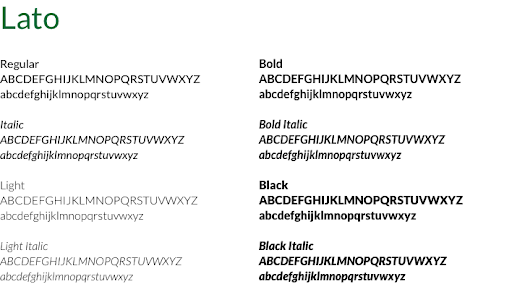
Web Typeface
Since web browsers do not always accommodate NOVA’s primary sans serif typeface, ITC Franklin Gothic, we recommend Lato as the default sans serif font for web use or when Franklin Gothic is not available. Lato can be downloaded for free from Google Fonts.